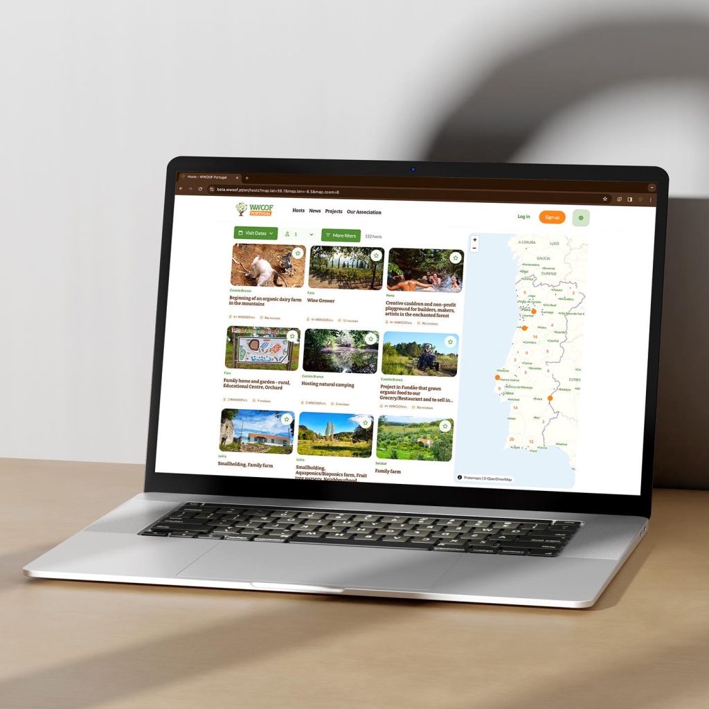
We have exciting news for our members: the WWOOF Canada website has undergone a visual makeover, along with the websites of 21 other organizations utilizing the Common WWOOF Platform. Rest assured, these changes are not significant. We have made subtle enhancements to the site’s interface, aiming to provide a clearer, more user-friendly, and modern experience. This update also offered us a valuable opportunity to review and refine the website’s content. Our goal is to offer clearer insights into who we are as an organization and how WWOOFing works to those who are approaching the WWOOF world for the first time.
- The map has been simplified to enhance the visibility of city names.
- When looking at host profiles, sections related to accommodation and meals have been repositioned lower in the list, de-prioritizing food and lodging to give a higher priority to the host’s agricultural practices.
- Photos are now presented in a mosaic format – one larger main photo plus two smaller photos beside it. Clicking the Show More button, all further pictures can be seen in their original format – both horizontal and vertical pictures are in fact displayed in their entirety. Users can now include captions to each photo, as well as rotate, crop, or enlarge images before saving them.
- When accessing your profile on a mobile device, the Notifications and Inbox are no longer located at the bottom of the page. Instead, there is a single button called “Inbox,” where two options appear upon clicking: Messages and Notifications.
- A new filter, named “Unanswered,” is now available in your message box. This filter proves especially useful for hosts seeking to quickly identify requests they have yet to respond to.
All modifications have been implemented to improve your experience when using our website. We hope you appreciate the new look 🌱
If you have any questions, concerns or comments, please write to info@wwoof.ca

